
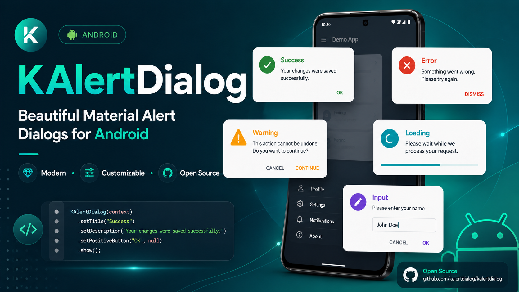
KAlertDialog is a beautiful, modern, customizable Material-style AlertDialog library for Android.
It helps Android developers create professional dialogs such as success dialogs, error dialogs, warning dialogs, progress dialogs, input dialogs, custom image dialogs, URL image dialogs, and custom view dialogs with simple Java code.

Released on 21-05-2026
- Added option to set font weight for title and content.
- Added modern style presets.
- Added dialog corner radius customization.
- Added dialog elevation customization.
- Added dialog dim amount customization.
- Added input validation support.
- Added input max length support.
- Added input type support.
- Added custom view dialog support.
- Added button text size customization.
- Added button font weight customization.
- Added button all-caps control.
- Added button icon support.
- Added URL image placeholder support.
- Added URL image error drawable support.
- Added progress shortcut methods.
- Added show and dismiss callback APIs.
- Added support for custom button drawables.
- Updated ProgressX library to latest version.
- Updated compileSdk and targetSdk to 37 across the project.
- Increased minSdkVersion to 23.
- Updated dependencies including Glide 5.0.7, Material 1.14.0, and AppCompat 1.7.1.
- Upgraded Gradle Wrapper to 9.4.1 and Android Gradle Plugin to 9.2.1.
- Refactored publishing configuration using modern
maven-publish. - Configured Java toolchain to version 17.
- Cleaned up Gradle properties and
.gitignore.
Older versions of this library have been removed.
Please use the latest version of KAlertDialog.
Latest version is migrated to AndroidX.
Follow me on Instagram to stay up-to-date: https://instagram.com/coderx09
Follow me on Twitter/X to stay up-to-date: https://twitter.com/a_masram444
Thanks to all contributors who helped improve this library.
- Material-style alert dialogs.
- Auto dark mode support.
- AndroidX support.
- Success dialog.
- Error dialog.
- Warning dialog.
- Normal message dialog.
- Progress/loading dialog.
- Input field dialog.
- Custom image dialog.
- URL image dialog.
- Custom view dialog.
- Modern style presets.
- Custom dialog corner radius.
- Custom dialog elevation.
- Custom dialog dim amount.
- Change title font.
- Change content font.
- Change button font.
- Change title font weight.
- Change content font weight.
- Change confirm button font weight.
- Change cancel button font weight.
- Change title text color.
- Change content text color.
- Change button text color.
- Change button background color.
- Add custom drawable background to confirm button.
- Add custom drawable background to cancel button.
- Add icons to confirm and cancel buttons.
- Control button text size.
- Control button all-caps behavior.
- Show vector drawable image with tint option in dark mode.
- Show custom image from URL.
- URL image circle crop support.
- URL image big image support.
- URL image placeholder support.
- URL image error drawable support.
- Change content text alignment.
- Change title layout alignment.
- Input validation support.
- Input max length support.
- Input type support.
- Progress helper support.
- Progress shortcut methods.
- Show and dismiss callback support.
- Dynamic alert type change.
Below are some examples of dialogs created using KAlertDialog.
Modern Success Dialog
|
Custom Radius, Elevation and Dim
|
Title and Content Font Weight
|
|
Basic Message Dialog
|
Error Dialog
|
Warning Confirm / Cancel Flow
|
|
Input Validation Dialog
|
Custom View Dialog
|
||
Custom Icon Dialog
|
URL Image Circle Dialog
|
Big URL Image Dialog
|
|
Custom Button Drawable Dialog
|
Button Icon Styling Dialog
|
Progress Shortcut Methods
|
Show and Dismiss Callbacks
|
The simplest way to use KAlertDialog is to add it as a dependency in your Android project.
For most modern Android projects, add this in settings.gradle or settings.gradle.kts.
dependencyResolutionManagement {
    repositoriesMode.set(RepositoriesMode.FAIL_ON_PROJECT_REPOS)
    repositories {
        google()
        mavenCentral()
        maven { url 'https://jitpack.io' }
    }
}dependencyResolutionManagement {
repositoriesMode.set(RepositoriesMode.FAIL_ON_PROJECT_REPOS)
repositories {
google()
mavenCentral()
maven(url = "https://jitpack.io")
}
}For older projects, add this in your root build.gradle:
allprojects {
    repositories {
        google()
        mavenCentral()
        maven { url 'https://jitpack.io' }
    }
}In your app-level build.gradle, add:
dependencies {
    implementation 'io.github.tutorialsandroid:kalertdialog:21.0.0'
    implementation 'io.github.tutorialsandroid:progressx:7.0.5'
}
For Kotlin DSL:
dependencies {
    implementation("io.github.tutorialsandroid:kalertdialog:21.0.0")
    implementation("io.github.tutorialsandroid:progressx:7.0.5")
}Starting from the latest versions of KAlertDialog and ProgressX, this library is built with the latest Android SDK.
If you are using:
implementation 'io.github.tutorialsandroid:kalertdialog:21.0.0'
implementation 'io.github.tutorialsandroid:progressx:7.0.5'
your app must compile against Android API 37 or higher.
In your app-level build.gradle, make sure your compileSdk is set to 37 or higher:
android {
    compileSdk 37

    defaultConfig {
        minSdk 23
        targetSdk 36
    }
}
For Kotlin DSL:
android {
    compileSdk = 37

    defaultConfig {
        minSdk = 23
        targetSdk = 36
    }
}If your project is using an older compileSdk, for example:
compileSdk 36you may see an error like this:
Dependency 'io.github.tutorialsandroid:kalertdialog:21.0.0' requires libraries and applications
that depend on it to compile against version 37 or later of the Android APIs.

:app is currently compiled against android-36.1.
This happens because the latest version of KAlertDialog and ProgressX is compiled with Android API 37.
Updating compileSdk is safe and different from updating targetSdk or minSdk.
compileSdkallows your app to compile with the latest Android APIs.targetSdkcontrols which Android runtime behavior changes your app opts into.minSdkcontrols the minimum Android version your app can be installed on.
So you can update only compileSdk to 37 while keeping your existing targetSdk and minSdk.
Update your app-level Gradle file:
android {
    compileSdk 37
}
Then sync the project again in Android Studio.
If Android Studio asks to install Android API 37, install it from:
Tools > SDK Manager > Android SDKAfter updating compileSdk, the AAR metadata error should be resolved.
new KAlertDialog(this)
        .setTitleText("Here's a message!")
.show();new KAlertDialog(this)
.setTitleText("Here's a message!")
.setContentText("It's pretty, isn't it?")
.show();new KAlertDialog(this, KAlertDialog.NORMAL_TYPE, true)
.setTitleText("KAlertDialog")
.setContentText("This is a clean and modern alert dialog.")
.setConfirmClickListener("OK", null)
.show();KAlertDialog supports multiple dialog types:
KAlertDialog.NORMAL_TYPE
KAlertDialog.ERROR_TYPE
KAlertDialog.SUCCESS_TYPE
KAlertDialog.WARNING_TYPE
KAlertDialog.CUSTOM_IMAGE_TYPE
KAlertDialog.URL_IMAGE_TYPE
KAlertDialog.PROGRESS_TYPE
KAlertDialog.INPUT_TYPE
KAlertDialog.CUSTOM_VIEW_TYPEnew KAlertDialog(this, KAlertDialog.SUCCESS_TYPE, true)
.setTitleText("Good job!")
.setContentText("You clicked the button!")
.setConfirmClickListener("OK", null)
.show();new KAlertDialog(this, KAlertDialog.ERROR_TYPE, true)
.setTitleText("Oops...")
.setContentText("Something went wrong!")
.setConfirmClickListener("Try Again", null)
.show();new KAlertDialog(this, KAlertDialog.WARNING_TYPE, true)
.setTitleText("Are you sure?")
.setContentText("You won't be able to recover this file!")
.setConfirmClickListener("Yes, delete it!", null)
.show();new KAlertDialog(this, KAlertDialog.WARNING_TYPE, true)
.setTitleText("Are you sure?")
.setContentText("You won't be able to recover this file!")
.showCancelButton(true)
.setCancelClickListener("Cancel", dialog -> {
dialog.setTitleText("Cancelled")
.setContentText("Your file is safe.")
.showCancelButton(false)
.setConfirmClickListener("OK", null)
.changeAlertType(KAlertDialog.ERROR_TYPE);
})
.setConfirmClickListener("Delete", dialog -> {
dialog.setTitleText("Deleted")
.setContentText("Your file has been deleted.")
.showCancelButton(false)
.setConfirmClickListener("OK", null)
.changeAlertType(KAlertDialog.SUCCESS_TYPE);
})
.show();KAlertDialog includes built-in style presets.
KAlertDialog.STYLE_CLASSIC
KAlertDialog.STYLE_MODERN
KAlertDialog.STYLE_MINIMAL
KAlertDialog.STYLE_ROUNDEDnew KAlertDialog(this, KAlertDialog.SUCCESS_TYPE, true)
.setTitleText("Success")
.setContentText("Your changes were saved successfully.")
.applyStyle(KAlertDialog.STYLE_MODERN)
.setConfirmClickListener("Done", dialog -> dialog.dismissWithAnimation())
.show();new KAlertDialog(this, KAlertDialog.WARNING_TYPE, true)
.setTitleText("Delete this file?")
.setContentText("This action cannot be undone.")
.applyStyle(KAlertDialog.STYLE_ROUNDED)
.showCancelButton(true)
.setCancelClickListener("Cancel", null)
.setConfirmClickListener("Delete", null)
.show();You can customize the dialog background, corner radius, elevation, and dim amount.
new KAlertDialog(this, KAlertDialog.NORMAL_TYPE, true)
.setTitleText("Custom Appearance")
.setContentText("This dialog has custom radius, elevation and dim amount.")
.setDialogCornerRadius(30)
.setDialogElevation(14)
.setDimAmount(0.55f)
.setConfirmClickListener("Looks Good", null)
.show();Available methods:
.setDialogBackgroundColor(Color.WHITE)
.setDialogBackgroundColorResource(R.color.white)
.setDialogCornerRadius(30)
.setDialogElevation(14)
.setDimAmount(0.55f)KAlertDialog pDialog = new KAlertDialog(this, KAlertDialog.PROGRESS_TYPE, true);
pDialog.setTitleText("Loading");
pDialog.setCancelable(false);
pDialog.show();KAlertDialog pDialog = new KAlertDialog(this, KAlertDialog.PROGRESS_TYPE, true);
pDialog.getProgressHelper().setBarColor(Color.parseColor("#A5DC86"));
pDialog.setTitleText("Loading");
pDialog.setCancelable(false);
pDialog.show();You can customize the progress bar dynamically using:
pDialog.getProgressHelper().resetCount();
pDialog.getProgressHelper().isSpinning();
pDialog.getProgressHelper().spin();
pDialog.getProgressHelper().stopSpinning();
pDialog.getProgressHelper().getProgress();
pDialog.getProgressHelper().setProgress(0.5f);
pDialog.getProgressHelper().setInstantProgress(0.5f);
pDialog.getProgressHelper().getCircleRadius();
pDialog.getProgressHelper().setCircleRadius(80);
pDialog.getProgressHelper().getBarWidth();
pDialog.getProgressHelper().setBarWidth(6);
pDialog.getProgressHelper().getBarColor();
pDialog.getProgressHelper().setBarColor(Color.GREEN);
pDialog.getProgressHelper().getRimWidth();
pDialog.getProgressHelper().setRimWidth(2);
pDialog.getProgressHelper().getRimColor();
pDialog.getProgressHelper().setRimColor(Color.LTGRAY);
pDialog.getProgressHelper().getSpinSpeed();
pDialog.getProgressHelper().setSpinSpeed(1.0f);Latest versions also support direct shortcut methods:
new KAlertDialog(this, KAlertDialog.PROGRESS_TYPE, true)
.setTitleText("Processing")
.setContentText("Please wait while we prepare your request.")
.applyStyle(KAlertDialog.STYLE_MODERN)
.setProgressColor(Color.parseColor("#10B981"))
.setProgressSpinSpeed(1.1f)
.show();Available progress shortcut methods:
.setProgressColor(Color.GREEN)
.setProgressColorResource(R.color.success_stroke_color)
.setProgressWidth(6)
.setProgressValue(0.5f)
.setProgressInstantValue(0.5f)
.setProgressSpinSpeed(1.1f)
.setProgressCircleRadius(80)KAlertDialog dialog = new KAlertDialog(this, KAlertDialog.INPUT_TYPE, true);
dialog.setTitleText("Edit Text");
dialog.setInputFieldHint("Write message");
dialog.setInputFieldText("Hello World!");
dialog.setConfirmClickListener("OK", kAlertDialog -> {
kAlertDialog.dismissWithAnimation();
String inputText = kAlertDialog.getInputText();
Toast.makeText(this, inputText, Toast.LENGTH_SHORT).show();
});
dialog.show();new KAlertDialog(this, KAlertDialog.INPUT_TYPE, true)
.setTitleText("Create Project")
.setContentText("Enter a project name with at least 3 characters.")
.applyStyle(KAlertDialog.STYLE_MODERN)
.setInputFieldHint("Project name")
.setInputFieldText("KAlertDialog")
.setInputType(InputType.TYPE_CLASS_TEXT | InputType.TYPE_TEXT_FLAG_CAP_WORDS)
.setInputMaxLength(30)
.setInputError("Project name must be at least 3 characters")
.setInputValidator(input -> input != null && input.trim().length() >= 3)
.setOnInputConfirmListener((dialog, input) -> {
dialog.dismissWithAnimation();
Toast.makeText(this, "Created: " + input.trim(), Toast.LENGTH_SHORT).show();
})
.setConfirmClickListener("Create", null)
.show();Available input methods:
.setInputFieldHint("Project name")
.setInputFieldText("KAlertDialog")
.setInputType(InputType.TYPE_CLASS_TEXT)
.setInputMaxLength(30)
.setInputError("Invalid input")
.setInputValidator(input -> input.trim().length() >= 3)
.setOnInputConfirmListener((dialog, input) -> { })
.getInputText()You can add your own custom XML layout inside KAlertDialog.
KAlertDialog dialog = new KAlertDialog(this, KAlertDialog.CUSTOM_VIEW_TYPE, true)
.setTitleText("Custom View")
.setContentText("This dialog uses your custom XML layout.")
.applyStyle(KAlertDialog.STYLE_MODERN)
.setCustomView(R.layout.customedittext)
.showCancelButton(true)
.setCancelClickListener("Cancel", kAlertDialog -> kAlertDialog.dismissWithAnimation());
dialog.setConfirmClickListener("Save", kAlertDialog -> {
View customView = kAlertDialog.getCustomView();
if (customView == null) {
return;
}
EditText editText = customView.findViewById(R.id.edit_query);
String value = editText.getText().toString().trim();
if (value.length() < 3) {
editText.setError("Please enter at least 3 characters");
return;
}
kAlertDialog.dismissWithAnimation();
Toast.makeText(this, "Saved: " + value, Toast.LENGTH_SHORT).show();
});
dialog.show();Available custom view methods:
.setCustomView(R.layout.custom_layout)
.setCustomView(view)
.getCustomView()new KAlertDialog(this, KAlertDialog.CUSTOM_IMAGE_TYPE, true)
.setTitleText("Sweet!")
.setContentText("Here's a custom image.")
.setCustomImage(R.drawable.custom_img)
.setConfirmClickListener("OK", null)
.show();new KAlertDialog(this, KAlertDialog.CUSTOM_IMAGE_TYPE, true)
.setTitleText("Sweet!")
.setContentText("Here's a custom vector image.")
.setCustomImage(R.drawable.vector_drawable)
.setDrawableTintOnNightMode(true, R.color.white)
.setConfirmClickListener("OK", null)
.show();KAlertDialog supports URL image dialogs with two display types:
KAlertDialog.IMAGE_BIG
KAlertDialog.IMAGE_CIRCLEnew KAlertDialog(this, KAlertDialog.URL_IMAGE_TYPE, true)
.setTitleText("Circle URL Image")
.setContentText("This image is loaded from a URL using circle crop mode.")
.applyStyle(KAlertDialog.STYLE_MODERN)
.setURLImagePlaceholder(R.mipmap.ic_launcher)
.setURLImageError(R.mipmap.ic_launcher)
.setURLImage("https://example.com/image.png", KAlertDialog.IMAGE_CIRCLE)
.setConfirmClickListener("Nice", null)
.show();new KAlertDialog(this, KAlertDialog.URL_IMAGE_TYPE, true)
.setTitleText("Big URL Image")
.setContentText("This image is loaded from a URL as a large image.")
.applyStyle(KAlertDialog.STYLE_ROUNDED)
.setURLImagePlaceholder(R.mipmap.ic_launcher)
.setURLImageError(R.mipmap.ic_launcher)
.setURLImage("https://example.com/image.png", KAlertDialog.IMAGE_BIG)
.setConfirmClickListener("Close", null)
.show();Available URL image methods:
.setURLImage("https://example.com/image.png", KAlertDialog.IMAGE_CIRCLE)
.setURLImage("https://example.com/image.png", KAlertDialog.IMAGE_BIG)
.setURLImagePlaceholder(R.drawable.placeholder)
.setURLImageError(R.drawable.image_error)Place your font file in:
app/src/main/assets/fonts/Then use:
new KAlertDialog(this, KAlertDialog.NORMAL_TYPE, true)
.setTitleText("Custom Font")
.setTitleFontAssets("fonts/os.ttf")
.setContentText("The title uses a custom font from assets.")
.setConfirmClickListener("OK", null)
.show();new KAlertDialog(this, KAlertDialog.NORMAL_TYPE, true)
.setTitleText("Custom Font")
.setContentText("The content uses a custom font from assets.")
.setContentFontAssets("fonts/poppins_regular.ttf")
.setConfirmClickListener("OK", null)
.show();You can also place font files inside:
app/src/main/res/font/Then use:
new KAlertDialog(this, KAlertDialog.NORMAL_TYPE, true)
.setTitleText("Custom Font")
.setContentText("The content uses a font from res/font.")
.setContentFont(R.font.sf)
.setConfirmClickListener("OK", null)
.show();You can change title and content font weight.
new KAlertDialog(this, KAlertDialog.NORMAL_TYPE, true)
.setTitleText("Font Weight")
.setContentText("Title is bold and content is italic.")
.setTitleFontWeight(Typeface.BOLD)
.setContentFontWeight(Typeface.ITALIC)
.setConfirmClickListener("OK", null)
.show();Available values:
Typeface.NORMAL
Typeface.BOLD
Typeface.ITALIC
Typeface.BOLD_ITALICnew KAlertDialog(this, KAlertDialog.NORMAL_TYPE, true)
.setTitleText("Custom Colors")
.setContentText("Title and content colors can be customized.")
.setTitleColor(R.color.your_title_color)
.setContentColor(R.color.your_content_color)
.setConfirmClickListener("OK", null)
.show();new KAlertDialog(this, KAlertDialog.NORMAL_TYPE, true)
.setTitleText("Text Size")
.setContentText("You can customize title and content text size.")
.setTitleTextSize(20)
.setContentTextSize(16)
.setConfirmClickListener("OK", null)
.show();new KAlertDialog(this, KAlertDialog.NORMAL_TYPE, true)
.setTitleText("Text Alignment")
.setContentText("This content is aligned to the start.")
.setContentTextAlignment(View.TEXT_ALIGNMENT_VIEW_START, Gravity.START)
.setConfirmClickListener("OK", null)
.show();new KAlertDialog(this, KAlertDialog.NORMAL_TYPE, true)
.setTitleText("Text Alignment")
.setContentText("This content is centered.")
.setContentTextAlignment(View.TEXT_ALIGNMENT_CENTER, Gravity.CENTER)
.setConfirmClickListener("OK", null)
.show();new KAlertDialog(this, KAlertDialog.NORMAL_TYPE, true)
.setTitleText("Start Title")
.setTitleTextLayoutGravity(Gravity.START)
.setContentText("The title layout gravity is set to start.")
.setConfirmClickListener("OK", null)
.show();new KAlertDialog(this, KAlertDialog.NORMAL_TYPE, true)
.setTitleText("Custom Buttons")
.setContentText("Confirm and cancel buttons can use custom drawable backgrounds.")
.showCancelButton(true)
.setConfirmClickListener("Confirm", null)
.setCancelClickListener("Cancel", null)
.confirmButtonDrawable(R.drawable.red_button_background)
.cancelButtonDrawable(R.drawable.button_background)
.show();Example drawable:
<?xml version="1.0" encoding="utf-8"?>
<selector xmlns:android="http://schemas.android.com/apk/res/android">
<item android:state_pressed="true">
<shape android:shape="rectangle">
<solid android:color="#FF5474" />
<corners android:radius="6dp" />
</shape>
</item>
<item>
<shape android:shape="rectangle">
<solid android:color="#FF1744" />
<corners android:radius="6dp" />
</shape>
</item>
</selector>new KAlertDialog(this, KAlertDialog.NORMAL_TYPE, true)
.setTitleText("Button Text Color")
.setContentText("Button text colors can be customized.")
.setConfirmClickListener("OK", R.color.black, null)
.showCancelButton(true)
.setCancelClickListener("Cancel", R.color.black, null)
.show();new KAlertDialog(this, KAlertDialog.NORMAL_TYPE, true)
.setTitleText("Button Styling")
.setContentText("This example shows button text size, font weight, all caps control and button icons.")
.applyStyle(KAlertDialog.STYLE_MINIMAL)
.showCancelButton(true)
.setConfirmButtonTextSize(15)
.setCancelButtonTextSize(15)
.setConfirmButtonFontWeight(Typeface.BOLD)
.setCancelButtonFontWeight(Typeface.BOLD)
.setConfirmButtonAllCaps(false)
.setCancelButtonAllCaps(false)
.setConfirmButtonIcon(android.R.drawable.checkbox_on_background)
.setCancelButtonIcon(android.R.drawable.ic_menu_close_clear_cancel)
.setConfirmClickListener("Accept", dialog -> dialog.dismissWithAnimation())
.setCancelClickListener("Decline", dialog -> dialog.dismissWithAnimation())
.show();Available button methods:
.setConfirmButtonTextSize(15)
.setCancelButtonTextSize(15)
.setConfirmButtonFontWeight(Typeface.BOLD)
.setCancelButtonFontWeight(Typeface.BOLD)
.setConfirmButtonAllCaps(false)
.setCancelButtonAllCaps(false)
.setConfirmButtonIcon(R.drawable.ic_done)
.setCancelButtonIcon(R.drawable.ic_close)
.confirmButtonDrawable(R.drawable.confirm_background)
.cancelButtonDrawable(R.drawable.cancel_background)
.confirmButtonColor(R.color.colorPrimary)
.cancelButtonColor(R.color.colorAccent)new KAlertDialog(this, KAlertDialog.NORMAL_TYPE, true)
.setTitleText("No Confirm Button")
.setContentText("The confirm button is hidden.")
.showConfirmButton(false)
.show();new KAlertDialog(this, KAlertDialog.NORMAL_TYPE, true)
.setTitleText("No Cancel Button")
.setContentText("The cancel button is hidden.")
.showCancelButton(false)
.setConfirmClickListener("OK", null)
.show();new KAlertDialog(this, KAlertDialog.CUSTOM_IMAGE_TYPE, true)
.setTitleText("Custom Image")
.setContentText("Both buttons are hidden.")
.setCustomImage(R.drawable.custom_img)
.showConfirmButton(false)
.showCancelButton(false)
.show();Latest versions support modern callback-style methods.
new KAlertDialog(this, KAlertDialog.NORMAL_TYPE, true)
.setTitleText("Callbacks")
.setContentText("This dialog shows modern listener APIs.")
.applyStyle(KAlertDialog.STYLE_MODERN)
.showCancelButton(true)
.onDialogShow(dialog -> {
Toast.makeText(this, "Dialog shown", Toast.LENGTH_SHORT).show();
})
.onDialogDismiss(dialog -> {
Toast.makeText(this, "Dialog dismissed", Toast.LENGTH_SHORT).show();
})
.onConfirm(dialog -> {
Toast.makeText(this, "Confirmed", Toast.LENGTH_SHORT).show();
dialog.dismissWithAnimation();
})
.onCancel(dialog -> {
Toast.makeText(this, "Cancelled", Toast.LENGTH_SHORT).show();
dialog.dismissWithAnimation();
})
.setConfirmClickListener("Confirm", null)
.setCancelClickListener("Cancel", null)
.show();Available callback methods:
.onConfirm(dialog -> { })
.onCancel(dialog -> { })
.onDialogShow(dialog -> { })
.onDialogDismiss(dialog -> { })You can change the dialog type after a user action.
new KAlertDialog(this, KAlertDialog.WARNING_TYPE, true)
        .setTitleText("Are you sure?")
        .setContentText("You won't be able to recover this file!")
        .showCancelButton(true)
        .setCancelClickListener("Cancel", dialog -> {
            dialog.setTitleText("Cancelled")
                    .setContentText("Your file is safe.")
                    .showCancelButton(false)
                    .setConfirmClickListener("OK", null)
                    .changeAlertType(KAlertDialog.ERROR_TYPE);
        })
        .setConfirmClickListener("Delete", dialog -> {
            dialog.setTitleText("Deleted")
                    .setContentText("Your file has been deleted.")
                    .showCancelButton(false)
                    .setConfirmClickListener("OK", null)
                    .changeAlertType(KAlertDialog.SUCCESS_TYPE);
        })
.show();You can use basic HTML in title and content text.
new KAlertDialog(this, KAlertDialog.NORMAL_TYPE, true)
.setTitleText("<b>Important</b>")
.setContentText("<p>This is an <b>HTML</b> content message.</p>")
.setConfirmClickListener("OK", null)
.show();Pass true in the constructor to enable auto night mode support.
new KAlertDialog(this, KAlertDialog.SUCCESS_TYPE, true)
.setTitleText("Dark Mode Supported")
.setContentText("This dialog automatically adapts when your app is in night mode.")
.setConfirmClickListener("OK", null)
.show();The sample app demonstrates:
- Modern style preset.
- Custom dialog appearance.
- Font weight.
- Basic dialog.
- Success dialog.
- Error dialog.
- Warning confirm/cancel flow.
- Input validation.
- Custom view.
- Custom icon.
- URL circle image.
- URL big image.
- Custom drawable buttons.
- Button icon and text styling.
- Progress shortcut methods.
- Show and dismiss callbacks.
If you see:
Dependency 'io.github.tutorialsandroid:kalertdialog:21.0.0' requires libraries and applications
that depend on it to compile against version 37 or later of the Android APIs.Update your app-level Gradle file:
android {
compileSdk 37
}Then sync your project.
If the big image appears small, make sure your alert_dialog.xml gives custom_big_image a proper fixed height and its parent has match_parent width.
Recommended XML:
<FrameLayout
android:id="@+id/custom_image_frame"
android:layout_width="match_parent"
android:layout_height="wrap_content"
android:layout_marginTop="5dp"
android:gravity="center">
<ImageView
android:id="@+id/custom_big_image"
android:layout_width="match_parent"
android:layout_height="170dp"
android:layout_gravity="center"
android:adjustViewBounds="true"
android:visibility="gone"
android:scaleType="centerCrop" />
</FrameLayout>Also use centerCrop() in Glide for IMAGE_BIG.
For the latest version, the library handles keyboard visibility internally.
Use:
new KAlertDialog(this, KAlertDialog.INPUT_TYPE, true)
.setTitleText("Input")
.setInputFieldHint("Write message")
.setConfirmClickListener("OK", null)
.show();new KAlertDialog(context)
new KAlertDialog(context, autoNightMode)
new KAlertDialog(context, alertType, autoNightMode)KAlertDialog.NORMAL_TYPE
KAlertDialog.ERROR_TYPE
KAlertDialog.SUCCESS_TYPE
KAlertDialog.WARNING_TYPE
KAlertDialog.CUSTOM_IMAGE_TYPE
KAlertDialog.URL_IMAGE_TYPE
KAlertDialog.PROGRESS_TYPE
KAlertDialog.INPUT_TYPE
KAlertDialog.CUSTOM_VIEW_TYPEKAlertDialog.STYLE_CLASSIC
KAlertDialog.STYLE_MODERN
KAlertDialog.STYLE_MINIMAL
KAlertDialog.STYLE_ROUNDEDKAlertDialog.IMAGE_BIG
KAlertDialog.IMAGE_CIRCLE.setTitleText("Title")
.setContentText("Content")
.setTitleTextSize(20)
.setContentTextSize(16)
.setTitleColor(R.color.color)
.setContentColor(R.color.color)
.setTitleFont(R.font.font_name)
.setContentFont(R.font.font_name)
.setTitleFontAssets("fonts/font.ttf")
.setContentFontAssets("fonts/font.ttf")
.setTitleFontWeight(Typeface.BOLD)
.setContentFontWeight(Typeface.NORMAL)
.setTitleTextLayoutGravity(Gravity.START)
.setTitleTextGravity(Gravity.CENTER)
.setContentTextAlignment(View.TEXT_ALIGNMENT_CENTER, Gravity.CENTER).setConfirmClickListener("OK", listener)
.setCancelClickListener("Cancel", listener)
.showConfirmButton(true)
.showCancelButton(true)
.confirmButtonColor(R.color.color)
.cancelButtonColor(R.color.color)
.confirmButtonDrawable(R.drawable.drawable)
.cancelButtonDrawable(R.drawable.drawable)
.setConfirmButtonTextSize(15)
.setCancelButtonTextSize(15)
.setConfirmButtonFontWeight(Typeface.BOLD)
.setCancelButtonFontWeight(Typeface.BOLD)
.setConfirmButtonAllCaps(false)
.setCancelButtonAllCaps(false)
.setConfirmButtonIcon(R.drawable.icon)
.setCancelButtonIcon(R.drawable.icon).setInputFieldHint("Hint")
.setInputFieldText("Default text")
.setInputType(InputType.TYPE_CLASS_TEXT)
.setInputMaxLength(30)
.setInputError("Error message")
.setInputValidator(input -> input.trim().length() >= 3)
.setOnInputConfirmListener((dialog, input) -> { })
.getInputText().setCustomView(R.layout.custom_layout)
.setCustomView(view)
.getCustomView().setURLImage("https://example.com/image.png", KAlertDialog.IMAGE_CIRCLE)
.setURLImage("https://example.com/image.png", KAlertDialog.IMAGE_BIG)
.setURLImagePlaceholder(R.drawable.placeholder)
.setURLImageError(R.drawable.error_image).getProgressHelper()
.setProgressColor(Color.GREEN)
.setProgressColorResource(R.color.color)
.setProgressWidth(6)
.setProgressValue(0.5f)
.setProgressInstantValue(0.5f)
.setProgressSpinSpeed(1.1f)
.setProgressCircleRadius(80).applyStyle(KAlertDialog.STYLE_MODERN)
.setDialogBackgroundColor(Color.WHITE)
.setDialogBackgroundColorResource(R.color.white)
.setDialogCornerRadius(30)
.setDialogElevation(14)
.setDimAmount(0.55f).onConfirm(dialog -> { })
.onCancel(dialog -> { })
.onDialogShow(dialog -> { })
.onDialogDismiss(dialog -> { })Apache License 2.0
Copyright 2019 KAlertDialog

Licensed under the Apache License, Version 2.0 (the "License");
you may not use this file except in compliance with the License.
You may obtain a copy of the License at

 http://www.apache.org/licenses/LICENSE-2.0

Unless required by applicable law or agreed to in writing, software
distributed under the License is distributed on an "AS IS" BASIS,
WITHOUT WARRANTIES OR CONDITIONS OF ANY KIND, either express or implied.
See the License for the specific language governing permissions and
limitations under the License.