DialogSpell
spell-class: ".instant.DialogSpell"Important
Since 4.0 Beta 19.
| Value | Supported |
|---|---|
entity |
true |
location |
false |
entity_from_location |
false |
Instant spell, which opens a vanilla dialog. Most of these options support dynamic values through numeric or string expressions. Some exceptions will log at config-time, but expressions will only log exceptions for invalid values at cast-time if the plugin's debug is enabled using /ms debug.
If the spell doesn't match what you configured or is failing silently, enable debug and re-cast it to diagnose.
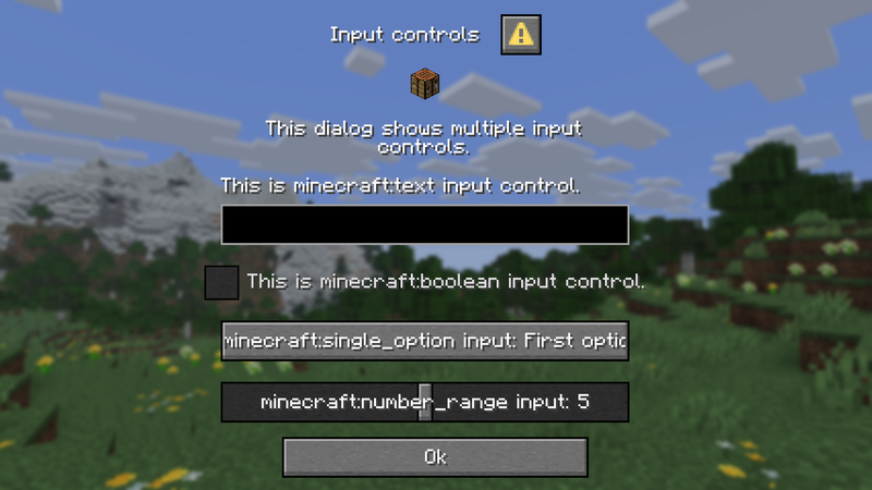
Below is an example of what a vanilla dialog looks like:
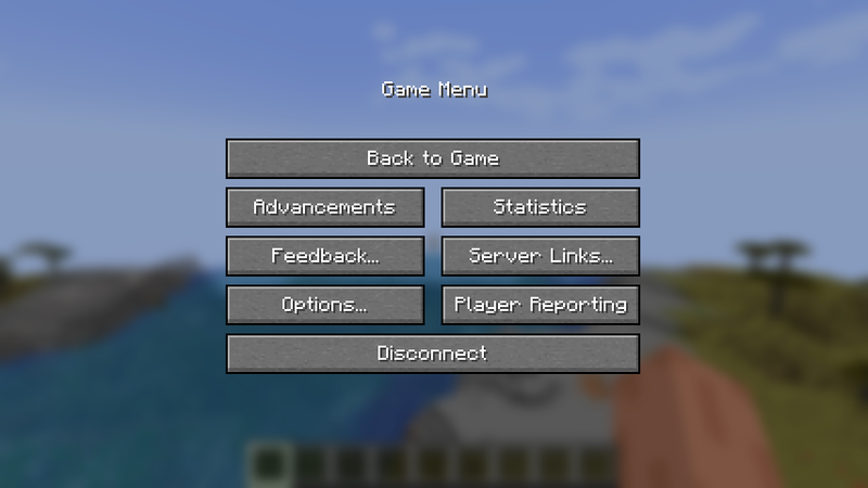
If you want to add URLs to the Server Links button in the pause menu (a button which only appears if there are Server Links on the server), you'll have to use a plugin which supports this feature, like AdvancedLinks.
| Option | Description | Type | Required | Supports expressions |
|---|---|---|---|---|
copy-from |
Namespaced ID | false |
true |
|
base |
Base Config | true |
||
dialog-type |
Dialog Type | true |
| Option | Description | Type | Default | Required | Supports expressions |
|---|---|---|---|---|---|
title |
Rich Text | true |
true |
||
can-close-with-escape |
Boolean | true |
false |
true |
|
after-action |
wait_for_response waits for 5s before fully closing the dialog. It is useful when your dialog leads to another dialog, to ensure the game doesn't allow head movement between dialogs, breaking immersion. |
DialogAfterAction | close |
false |
true |
body |
List of Body Elements | false |
|||
inputs |
List of Body Inputs | false |
| Option | Type | Required | Supports expressions |
|---|---|---|---|
type |
item or message
|
true |
false |
# Example:
body:
  - type: item
    item: magic_item
    description:
      message: Message
      width: 200
    show-decorations: true
    width: 16
    height: 16

  - type: message
    message: Message
width: 200| Option | Description | Type | Default | Required | Supports expressions |
|---|---|---|---|---|---|
item |
Magic Item String | true |
false |
||
description |
Plain Message | false |
|||
show-decorations |
Defines whether the item count and damage count are rendered. | Boolean | true |
false |
true |
show-tooltip |
Boolean | true |
false |
true |
|
width |
Within [1, 256]
|
Integer | 16 |
false |
true |
height |
Within [1, 256]
|
Integer | 16 |
false |
true |
| Option | Description | Type | Default | Required | Supports expressions |
|---|---|---|---|---|---|
message |
Rich Text | true |
true |
||
width |
Within [1, 1024]
|
Integer | 200 |
false |
true |
| Option | Type | Required | Supports expressions |
|---|---|---|---|
type |
bool, number_range, single_option, or text
|
true |
false |
| Option | Description | Type | Default | Required | Supports expressions |
|---|---|---|---|---|---|
key |
Can be _, letters, or digits. |
String | true |
true |
|
label |
Rich Text | true |
true |
||
initial |
Boolean | false |
false |
true |
|
on-true |
The text stored in the input when true. | String | "true" |
false |
true |
on-false |
The text stored in the input when false. | String | "false" |
false |
true |
# Example:
inputs:
  - type: bool
    key: input_bool
    label: "Bool Input"
    initial: false
    on-true: "true"
    on-false: "false"

  - type: ...
# . . .| Option | Description | Type | Default | Required | Supports expressions |
|---|---|---|---|---|---|
key |
Can be _, letters, or digits. |
String | true |
true |
|
label |
Rich Text | true |
true |
||
width |
Within [1, 1024]
|
Integer | 200 |
false |
true |
label-format |
Java string Format is used for building the label. The first argument is the contents of the label field, the second argument is the current value. Instead of a format, this can be a translation component, as it is by default. By default, the component holds the format "%s: %s" (e.g. "FOV: 90", as seen in settings), where arguments are passed to the format in order.You could also use %% to display a (single) percentage sing. This is useful in case your start/end range is [0, 100] and you want the user to input a percentage, you could make the label display a percentage as such - "%s: %s%%".With the default format, if your label is empty, the label will still print something like ": 10". You can use a format such as "%2$s" to only select the second argument - the current value. |
String | "options.generic_value" |
false |
true |
start |
Float | 0 |
false |
true |
|
end |
Float | 0 |
false |
true |
|
initial |
Within [start, end]. |
Float | 0 |
false |
true |
step |
Must be null (any step) or > 0 (only allows jumping by step). |
Float | 1 |
false |
true |
# Example:
inputs:
  - type: number_range
    key: input_number
    label: "Number Input"
    width: 200
    label-format: ""
    start: 0
    end: 100
    initial: 0
    step: 10

  - type: ...
# . . .| Option | Description | Type | Default | Required | Supports expressions |
|---|---|---|---|---|---|
key |
Can be _, letters, or digits. |
String | true |
true |
|
label |
Rich Text | true |
true |
||
width |
Within [1, 1024]
|
Integer | 200 |
false |
true |
label-visible |
Boolean | true |
false |
true |
|
entries |
Entries must not be empty. | List of Single Option Entries | true |
# Example:
inputs:
  - type: single_option
    key: input_single
    label: "Single Option Input"
    width: 200
    entries:
      - id: first
        display: First
        initial: true
      - id: second
        display: Second
      # Could be collapsed too
      - {id: third, display: Third}

  - type: ...
# . . .| Option | Description | Type | Default | Required | Supports expressions |
|---|---|---|---|---|---|
id |
Value to be sent on submit | String | true |
true |
|
display |
Rich Text | false |
true |
||
initial |
Only one option may be initially selected. | Boolean | false |
false |
true |
| Option | Description | Type | Default | Required | Supports expressions |
|---|---|---|---|---|---|
key |
Can be _, letters, or digits. |
String | true |
true |
|
label |
Rich Text | true |
true |
||
width |
Within [1, 1024]
|
Integer | 200 |
false |
true |
label-visible |
Boolean | true |
false |
true |
|
initial |
Must be within max-length. |
String | "" |
false |
true |
max-length |
Must be > 0. |
Integer | 32 |
false |
true |
multiline-options |
Text Multiline Options | false |
# Example:
inputs:
  - type: text
    key: input_text
    label: "Text Input"
    width: 200
    initial: ""
    max-length: 200

  - type: ...
# . . .| Option | Description | Type | Default | Required | Supports expressions |
|---|---|---|---|---|---|
max-lines |
Must be null or > 0. |
Integer | false |
true |
|
height |
Must be null or within [1, 512]. |
Integer | false |
true |
| Option | Type | Required | Supports expressions |
|---|---|---|---|
type |
confirmation, dialog_list, multi_action, notice, or server_links
|
true |
false |
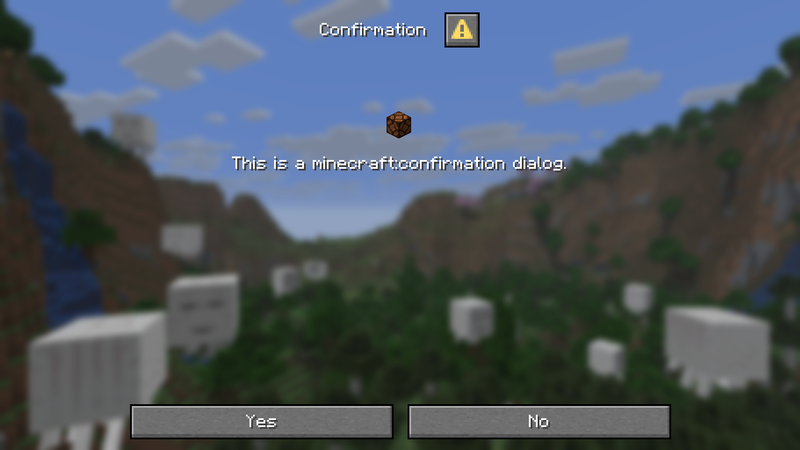
Two action buttons in the footer. By default, the exit action is the same as the no button's action.
| Option | Type | Required |
|---|---|---|
yes |
Action Button | true |
no |
Action Button | true |
dialog-type:
  type: confirmation
  yes:
    # ...
  no:
    # ...
| Option | Description | Type | Default | Required | Supports expressions |
|---|---|---|---|---|---|
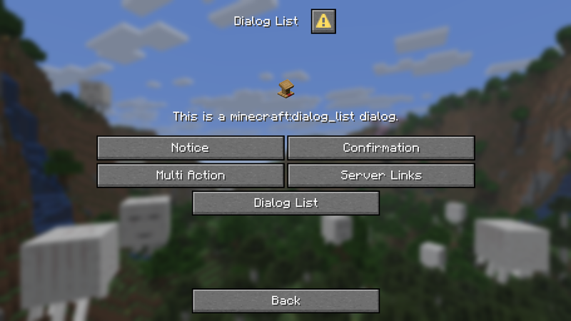
dialogs |
List of Namespaced IDs. Direct IDs should refer to a singular dialog, but IDs prefixed with # should refer to a Dialog tag (group of dialogs). Dialogs with their own Namespaced IDs can be registered by data packs or some PaperMC plugins. |
List of Dialogs | true |
false |
|
exit |
Action Button | false |
|||
columns |
Must be > 0. |
Integer | 2 |
false |
true |
button-width |
Must be within [1, 1024]. |
Integer | 150 |
false |
true |
dialog-type:
  type: dialog_list
  dialogs:
    - "some_plugin:some_dialog"
    - "#minecraft:quick_actions"
  exit:
    # ...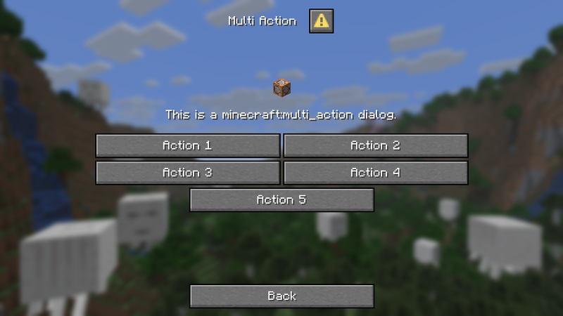
A dialog with multiple scrollable action buttons.
| Option | Description | Type | Default | Required | Supports expressions |
|---|---|---|---|---|---|
actions |
Cannot be empty. | List of Action Buttons | true |
||
exit |
Action Button | false |
|||
columns |
Must be > 0. |
Integer | 2 |
false |
true |
dialog-type:
  type: multi_action
  actions:
    - label: "Action 1"
      tooltip: "Empty action"

    - label: "Action 2"
      action:
        type: ...
        # ...

    - label: "Action 3"
      tooltip: "Empty action"
    # ...
  exit:
    # ...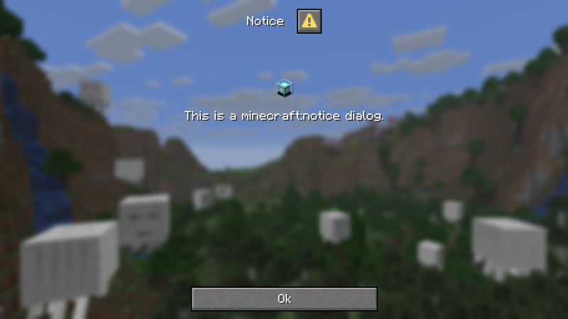
Single optional action button in the footer. By default, the exit action is the same as the button's action.
| Option | Type | Required |
|---|---|---|
button |
Action Button | false |
dialog-type:
  type: notice
  button:
# ...A dialog with a scrollable list of Server Links. An optional exit button, which will be used for the dialog exit action too.
| Option | Description | Type | Default | Required | Supports expressions |
|---|---|---|---|---|---|
exit |
Action Button | false |
|||
columns |
Must be > 0. |
Integer | 2 |
false |
true |
button-width |
Must be within [1, 1024]. |
Integer | 150 |
false |
true |
dialog-type:
  type: server_links
  exit:
# ...| Option | Description | Type | Default | Required | Supports expressions |
|---|---|---|---|---|---|
label |
Rich Text | true |
true |
||
tooltip |
Rich Text | false |
true |
||
width |
Within [1, 1024]
|
Integer | 150 |
false |
true |
action |
Button Action | false |
true |
| Option | Type | Required | Supports expressions |
|---|---|---|---|
type |
command_template, static_action, or custom_click
|
true |
false |
| Option | Description | Type | Required | Supports expressions |
|---|---|---|---|---|
template |
You must template a command using input key-s of your dialog inputs within $(key) (include the brackets). A command without any template arguments will fail. E.g. for key: message you can use template: "say $(message)". |
String | true |
true |
button-option:
  label: "Button"
  action:
    type: command_template
# . . .Put options within static section:
| Option | Type | Required | Supports expressions |
|---|---|---|---|
type |
open_url, run_command, suggest_command, copy_to_clipboard, or show_dialog
|
true |
false |
button-option:
  label: "Button"
  action:
    type: static_action
    static:
      type: ...
# ...| Option | Type | Required | Supports expressions |
|---|---|---|---|
url |
String | true |
true |
| Option | Type | Required | Supports expressions |
|---|---|---|---|
command |
String | true |
true |
| Option | Type | Required | Supports expressions |
|---|---|---|---|
command |
String | true |
true |
| Option | Type | Required | Supports expressions |
|---|---|---|---|
text |
String | true |
true |
| Option | Type | Required | Supports expressions |
|---|---|---|---|
dialog |
Namespaced ID refering to a Dialog. | true |
true |
Put options within click section:
| Option | Type | Required | Supports expressions |
|---|---|---|---|
type |
custom or spell
|
true |
false |
button-option:
  label: "Button"
  action:
    type: custom_click
    click:
      type: ...
# ...Useful for other plugins being able to capture the action.
| Option | Description | Type | Required | Supports expressions |
|---|---|---|---|---|
id |
Namespaced ID | true |
true |
|
additions |
SNBT formatted fields to be added to payload. | String | false |
true |
type: custom_click
click:
  type: custom
id: ms:my_spell/agree| Option | Description | Type | Required | Supports expressions |
|---|---|---|---|---|
spell |
Sub-spell | true |
true |
|
variables |
With this option, you can map values from user inputs to be stored in MS Variables. This is an optional list of key strings and variable variable names. The key must refer to a key from inputs. Bool and numeric inputs will resolve into "true"/"false" for string variable types, otherwise to a numeric output for numeric variable types (bool only to 0/1). Textual inputs will only resolve into string values for string variables. |
String List | false |
true |
type: custom_click
click:
  type: spell
  spell: my_spell
  variables:
    # Expanded:
    - key: input_1
      variable: input_1
    # Or compacted works:
- {key: input_2, variable: input_2}Simple dialog with one textual input.
variables:
    name:
      type: playerstring

dialog_name:
    spell-class: ".instant.DialogSpell"
    always-granted: true
    base:
      title: "Name Picker"
      body:
        - type: message
          message: "Pick a name."
      inputs:
        - type: text
          key: name
          label: "Name"
          multiline-options:
            max-lines: 1
    dialog-type:
      type: notice
      button:
        label: 'Select Name'
        action:
          type: custom_click
          click:
            type: spell
            spell: dialog_name_send(mode=full)
            variables:
              - key: name
                variable: name

dialog_name_send:
    spell-class: ".instant.DummySpell"
    helper-spell: true
    str-cast-self: 'Name: <gray>"<gold>%var:name%</gold>"</gray>'
In this example, we have a dialog selection of Minecraft sounds. The dialog will pass a sound spell argument so that it is stored in a variable and so another dialog spell is cast. The second dialog will let the user move sliders for the sound's volume and pitch. Clicking "Play" will keep the dialog open and play the sound with the user's selections.
variables:
    sound_name:
      type: playerstring
    sound_volume:
      type: player
    sound_pitch:
      type: player

soundboard:
    spell-class: ".instant.DialogSpell"
    always-granted: true
    base:
      title: "Soundboard"
      after-action: wait_for_response
      body:
        - type: message
          message: "Pick a sound."
    dialog-type:
      type: multi_action
      columns: 1
      actions:
        - label: '<sprite:items:item/creeper_spawn_egg> <gold>Creeper Primed</gold> Sound'
          tooltip: "entity.creeper.primed"
          action:
            type: custom_click
            click:
              type: spell
              spell: soundboard_pick(args=["entity.creeper.primed"])
        - label: '<sprite:items:item/trident> <gold>Trident Return</gold> Sound'
          tooltip: "item.trident.return"
          action:
            type: custom_click
            click:
              type: spell
              spell: soundboard_pick(args=["item.trident.return"])
        - label: '<sprite:items:item/brush> <gold>Brush Brushing</gold> Sound'
          tooltip: "item.brush.brushing.generic"
          action:
            type: custom_click
            click:
              type: spell
              spell: soundboard_pick(args=["item.brush.brushing.generic"])

soundboard_pick:
    spell-class: ".instant.DummySpell"
    helper-spell: true
    modifiers:
      - always string sound_name %arg:1%
      - always cast soundboard_configure

soundboard_configure:
    spell-class: ".instant.DialogSpell"
    helper-spell: true
    base:
      title: "Soundboard"
      after-action: none
      body:
        - type: message
          message: "Picked sound: <gold>%var:sound_name%"
        - type: message
          message: "Optionally adjust pitch and volume before playing the sound."
      inputs:
        - type: number_range
          key: sound_volume
          label: "Volume"
          start: 0
          initial: 1
          end: 10
          step: 0.5
        - type: number_range
          key: sound_pitch
          label: "Pitch"
          start: 0
          initial: 1
          end: 2
          step: 0.05
    dialog-type:
      type: confirmation
      button-yes:
        label: "Play Sound"
        action:
          type: custom_click
          click:
            type: spell
            spell: soundboard_play(mode=full)
            variables:
              - {key: sound_volume, variable: sound_volume}
              - {key: sound_pitch, variable: sound_pitch}
      button-no:
        label: "Close"
        action:
          type: custom_click
          click:
            type: spell
            spell: soundboard_close

soundboard_close:
    spell-class: ".targeted.CloseDialogSpell"
    helper-spell: true
    target-self: true

soundboard_play:
    spell-class: ".ExternalCommandSpell"
    helper-spell: true
    do-variable-replacement: true
    execute-on-console-instead: true
    str-cast-self: "Played <gold>%var:sound_name%</gold> with volume <gold>%var:sound_volume:3%</gold> and pitch <gold>%var:sound_pitch:3%</gold>."
    command-to-execute: ['execute at %a run playsound %var:sound_name% master %a ~ ~ ~ %var:sound_volume:3% %var:sound_pitch:3%']