


English · 简体中文
Documentation · Playground · Configuration · llms.txt
You write px the way the design file says. The compiler converts it. But converting means nothing until you know which design file that px was drawn on — and that is the whole model.
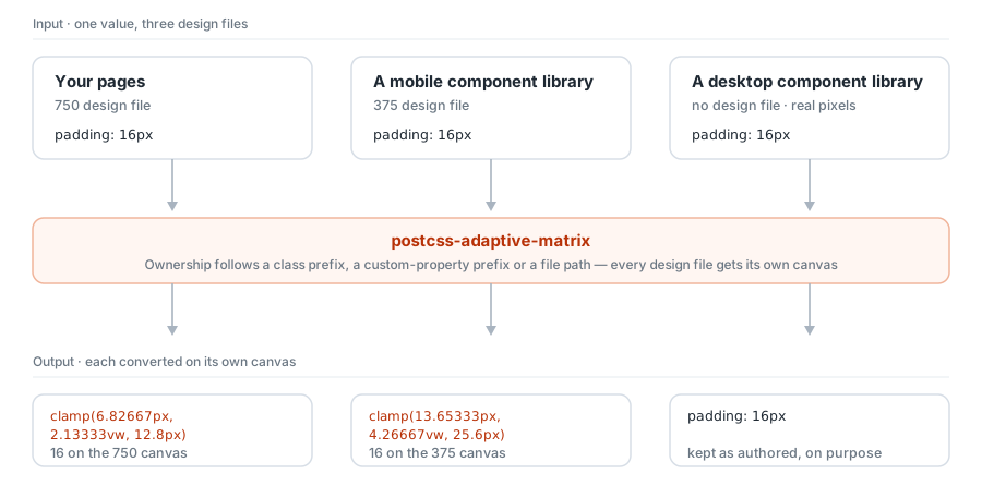
Your pages are drawn on a 750 file. The mobile component library you installed was drawn on 375. The desktop one has no design file at all — it was drawn in real pixels. Push all three through one conversion formula and you are picking which of three answers to get wrong.
An ignore list does not rescue this. It offers exactly two outcomes: the page scales while the components stay put, or the components get stretched against a canvas that was never theirs.
Giving each design file its own canvas is the answer. And it is the default — there is nothing to configure.
npm i -D postcss postcss-adaptive-matrixpostcss.config.mjs:
import adaptiveMatrix, { appPcPreset } from 'postcss-adaptive-matrix'

export default {
  plugins: [
    adaptiveMatrix(
      appPcPreset({
        appDesignWidth: 375,
        pcDesignWidth: 1440,
        rootSelector: '#app',
      }),
    ),
  ],
}
Write CSS as you always have:
.page {
  padding: 16px;
  font-size: 16px;
}

@adaptive pc {
  .page {
    padding: 48px 64px;
  }
}
Output:
.page {
  padding: clamp(13.65333px, 4.26667vw, 20.48px);
  font-size: clamp(0.94867rem, calc(0.65rem + 1.49333vw), 1.098rem);
}

@media (min-width: 768px) {
  .page {
    padding: clamp(34.13333px, 3.33333vw, 64px) clamp(45.51111px, 4.44444vw, 85.33333px);
  }
}
At this point component-library adaptation, safe-area variables, the centred root column and the position: fixed correction are all already working. No further configuration.
| Multiple canvases | App, desktop, tablet, in-car — each with its own design width, breakpoint, fluid range and unit |
| Bounded fluid sizing | clamp() by default: no runaway growth on a wide screen, no collapse on a narrow one |
| Accessible text | A rem + vw hybrid, so browser text zoom keeps working (WCAG 1.4.4) |
| Component libraries built in | 11 mainstream libraries, each converted on its own canvas — no ignore list |
| Theme tokens | Library custom properties on :root are recognised by name; font sizes take the text formula automatically |
| Fixed-position correction | position: fixed stops escaping to the viewport edge inside a centred column |
| Container queries | unit: 'cqi' with @container: sizes follow an ancestor rather than the window |
| Atomic CSS | Tailwind and UnoCSS, both major versions, including the theme tokens their utilities read |
| Optional runtime | A VisualViewport observer for WebViews, on-screen keyboards and dynamic viewports |
| CLI preview | Change a number, see the converted declarations — no build, no browser |
| Breakpoint seam check | Finds every place where widening the window makes something smaller — where two design files disagree |
| Browser support audit | Checks the compiled output against the oldest browsers you intend to support |
| Engineering | Complete TypeScript types, ESM + CJS, and a language-agnostic conformance suite |
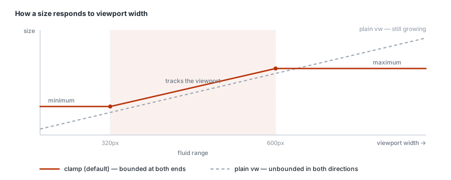
Plain vw grows without limit on a large screen and collapses without limit on a small one. The default strategy puts a floor and a ceiling on every size: inside the fluid range it tracks the viewport, outside it stops. A 600px tablet therefore does not get a phone UI blown up to fit.
adaptiveMatrix({
  defaultProfile: 'app',
  profiles: {
    app: { designWidth: 750, fluid: { minWidth: 320, maxWidth: 600 } },
  },
})
/* Input — 16px in all four places */
:root { --van-padding-md: 16px }
.van-cell { padding: 16px }
.el-input { padding: 16px }
.page-hero { padding: 16px }/* Output — each on the canvas it belongs to */
:root { --van-padding-md: clamp(13.65333px, 4.26667vw, 25.6px) }
.van-cell { padding: clamp(13.65333px, 4.26667vw, 25.6px) }
.el-input { padding: 16px }
.page-hero { padding: clamp(6.82667px, 2.13333vw, 12.8px) }Built in: vant, nutui, varlet, antd-mobile, taro-ui, element-plus, antd, arco-design, naive-ui, quasar, mui.
A library that is not listed takes one line to define; a listed one takes extends to adjust. See Component libraries.
/* adaptive-ignore-next */
width: 320px;              /* skip the next declaration */

height: 44px;              /* adaptive-ignore */   /* skip this line */

/* adaptive-ignore-rule */
.widget { width: 300px }   /* skip the whole rule that follows */
These comments survive into the output, so they still apply if the output is compiled again (a minifier removes them). Hairlines of 1px or less are left alone by default, and strings, url(), local() and format() are never converted by accident.
npx adaptive-matrix src/styles/app.csssrc/styles/app.css
profiles: app (default), pc, +5 library canvases
.page
padding 16px → clamp(13.65333px, 4.26667vw, 20.48px)
font-size 16px → clamp(0.94867rem, calc(0.65rem + 1.49333vw), 1.098rem)
@media (min-width: 768px) › .page
padding 48px → clamp(34.13333px, 3.33333vw, 64px)
shrinks .card font-size gets smaller at 768px: 17.57px → 16.18px
3 converted, 0 left as authored
No build to start, no browser to open.
That last line is the seam check. The app file says 16px and the desktop file says 18px; both are reasonable on their own. But the app canvas has already grown to 17.57px by the time it hands over, and the desktop canvas starts at 16.18px — so widening the window by one pixel makes the body text jump down. Every formula this compiler emits is non-decreasing in viewport width, so a size going backwards can only mean the canvas changed underneath it: two design files that were never compared at that width.
--from also lets you rehearse file-based routing, which is the easiest thing to misconfigure and the hardest to notice. See CLI preview.
npx adaptive-matrix src/app.css --targets "ios_saf 13, chrome 90" needs @layer — iOS Safari 13 < 15.4, Chrome 90 < 99
if unsupported: The whole @layer block is dropped, so the entire root
foundation goes with it — the centred column, the safe-area variables
and the fixed-position correction all vanish at once.
instead: root.layer: false emits the same rules unwrapped. ...
needs clamp(), min(), max() — iOS Safari 13 < 13.4-13.7
CSS does not degrade gracefully; it degrades by discarding, and it never says so. An unreadable value takes its declaration, an unreadable selector takes its rule, an unreadable at-rule takes its whole block. So the audit reads the compiled stylesheet — not your configuration, which is the only way the two can never drift — and for each feature says how much disappears before it says what to switch off.
Support versions are baked in at build time, so this adds no runtime dependency and works offline. See Browser support and degradation.
| Getting started | From install to a two-design-file workflow |
| Build tool integration | Vite, Nuxt, Webpack, Taro — and four ways to fail silently |
| CLI preview | npx adaptive-matrix: conversions without a build |
| Component libraries | The built-in list, how matching works, overriding and extending |
| Configuration reference | Every option, its type and its default |
| Architecture and formulas | The pipeline, the maths, idempotence, and the limits |
| Optional runtime | The VisualViewport observer: keyboards, address bars, WebViews |
| Browser support and degradation | Feature × version matrix, what gets discarded, how to switch each one off |
| Migration guide | Coming from another px conversion setup |
| Release and compatibility | Artifacts, Node versions, versioning policy |
| Conformance suite | A language-agnostic behavioural specification |
| Full example | A runnable app + desktop project |
Every page is available in both English and Simplified Chinese; use the switcher at the top of each one.
- Node.js 18+, PostCSS 8.4+
clamp()andmin()are baseline in modern browsers- Container-query configurations need a browser with
@containerandcqi - For older WebViews use
strategy: 'viewport', optionally withpreserveOriginal: truefor a fallback declaration — run--targetsto see exactly what your output asks for
npm install
npm run check          # types + coverage + build
npm run conformance:update
npm run benchMIT. See the contributing guide to get involved; please report security issues privately per the security policy.