Bootstrap Button
See the Sample Code.
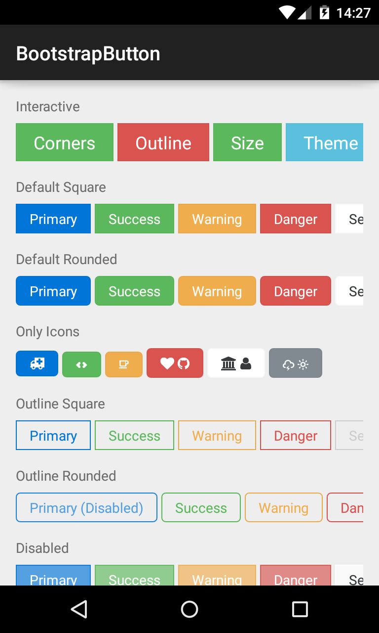
This button supports Glyph icons, and is colored using Bootstrap Brands. Appearance is controlled by various attributes, which are shown in XML below:
<com.beardedhen.androidbootstrap.BootstrapButton
 android:layout_width="wrap_content"
 android:layout_height="wrap_content"
 android:text="BootstrapButton"
 app:bootstrapBrand="success"
 app:bootstrapSize="lg"
 app:buttonMode="regular"
 app:showOutline="false"
 app:roundedCorners="true"
 />
The view's appearance can also be controlled via setters.
BootstrapButton button = new BootstrapButton(context);
button.setBootstrapBrand(DefaultBootstrapBrand.REGULAR);
button.setRounded(true);
button.setShowOutline(false);
button.setFontAwesomeIcon(FontAwesome.FA_ANDROID);